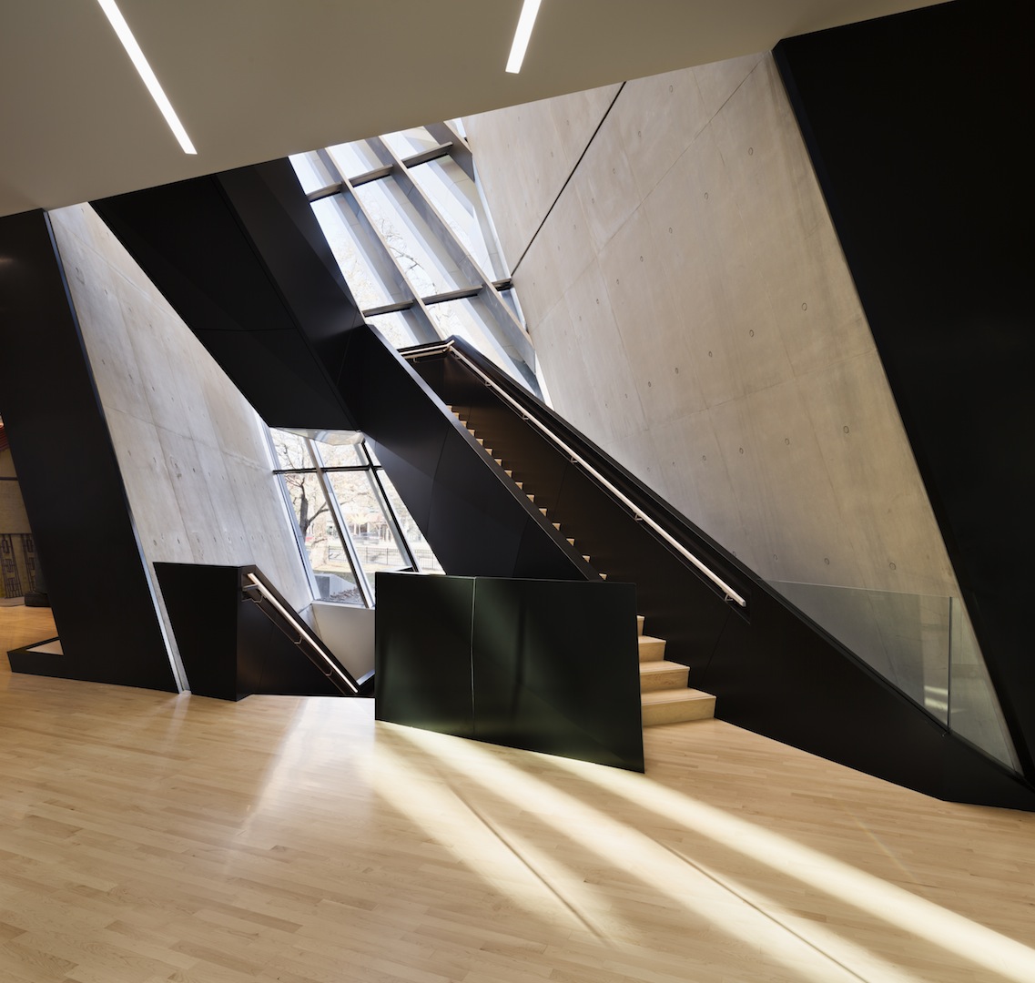
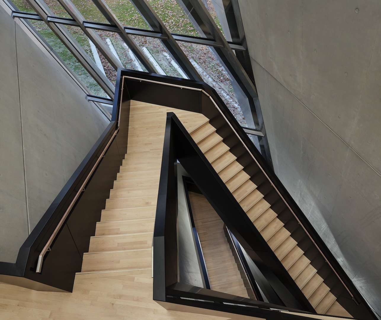
The staircase of Zaha Hadid Architects’ recently opened Eli and Edythe Broad Art Museum at Michigan State University in East Lansing is sleek and straightforward. Its intention is functional; its design is simple (as simple as a contorted, suspended mass can be). A departure from the use of a traditional grand stairway as a means of announcing the authority of an American cultural institution, its narrow path cuts through three distinct levels of sensory experience, as each floor of the museum has been configured to showcase a varied permanent collection.
Positioned as the building’s spine, the birch and black staircase urges visitors to follow the dynamic energy of piercing lines that begin at the base of the museum and are carried through sloping walls and ceilings. These lines are also seen in carefully divided windows, which are positioned so that views of the outside are mediated by a sense of forward motion.
 [Image by Paul Warchol (2012). Copyright the photographer. Courtesy of Zaha Hadid Architects.]
 [Image by Paul Warchol (2012). Copyright the photographer. Courtesy of Zaha Hadid Architects.]
This emphasis on movement brings to mind Ahmad Hamid’s description of the “economy in principle of time and space” of Islamic architecture. In lieu of grandiose focal points where one lingers, such minimalist practicality can be understood in reference to the Arabic saying “Those who dance on the stairs,” which cautions against remaining in a state of limbo (Hassan Fathy and Continuity in Islamic Arts and Architecture, The American University in Cairo Press, 2010).
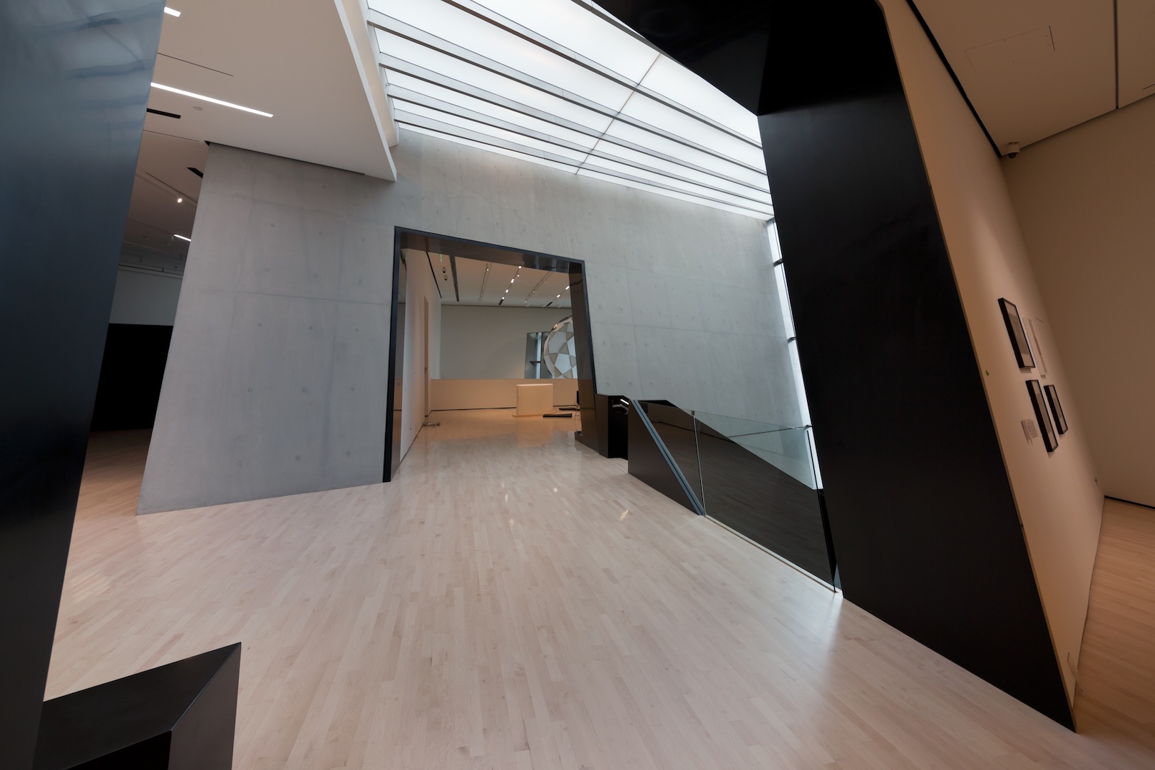
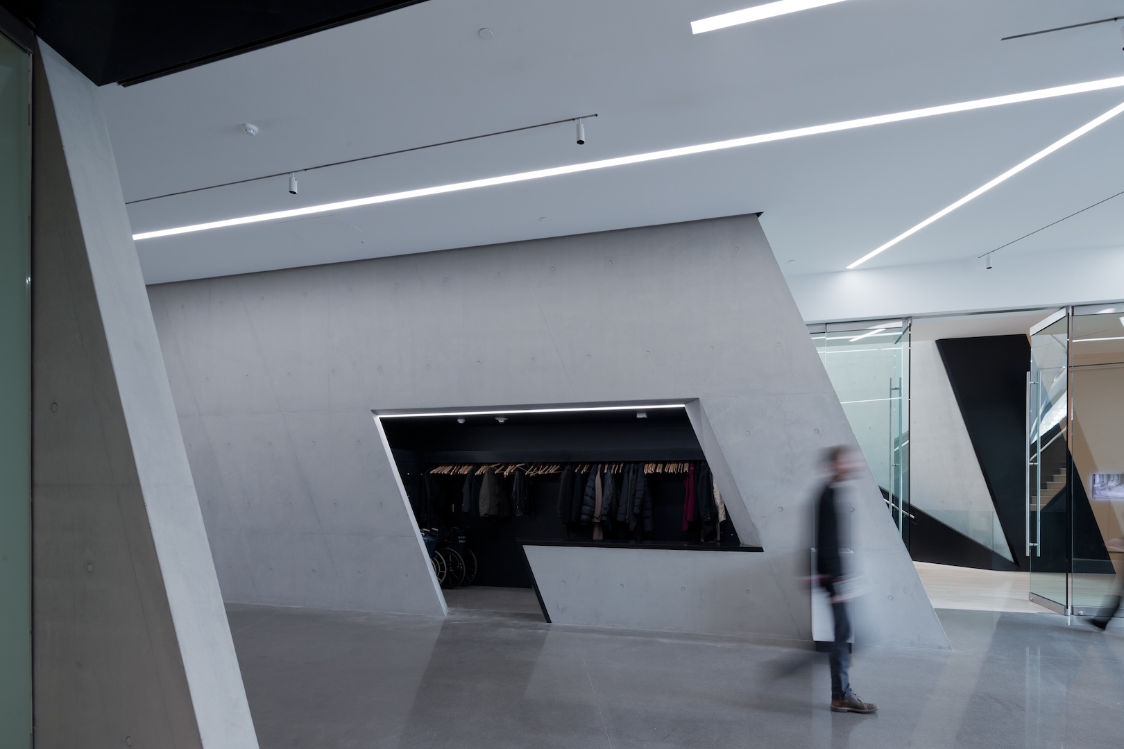
The London-based firm that is led by Hadid has labored over every detail: exit signs in the shape of parallelograms reference the outer frame of the structure; long, thin light fixtures defy spatial boundaries as they pass through rooms.
 [Image by Iwan Baan (2012). Copyright the photographer. Courtesy of Zaha Hadid Architects.]
 [Image by Iwan Baan (2012). Copyright the photographer. Courtesy of Zaha Hadid Architects.]
While the focus of the Broad Art Museum is a revolving display of art spanning centuries and continents, Hadid first considers the local context. Working from the existing plan of the campus, the building’s form was developed through the expansion of nearby pathways. As the architect reveals in a catalogue that was published to coincide with its inauguration in November, the intersections of pedestrian and cyclist trails were extended then folded into the three-dimensionality of the structure, thus definitions of space were established in relation to a series of meeting points. Hadid has also honored the flow of these patterns with the option of entering from opposite sides of the site.
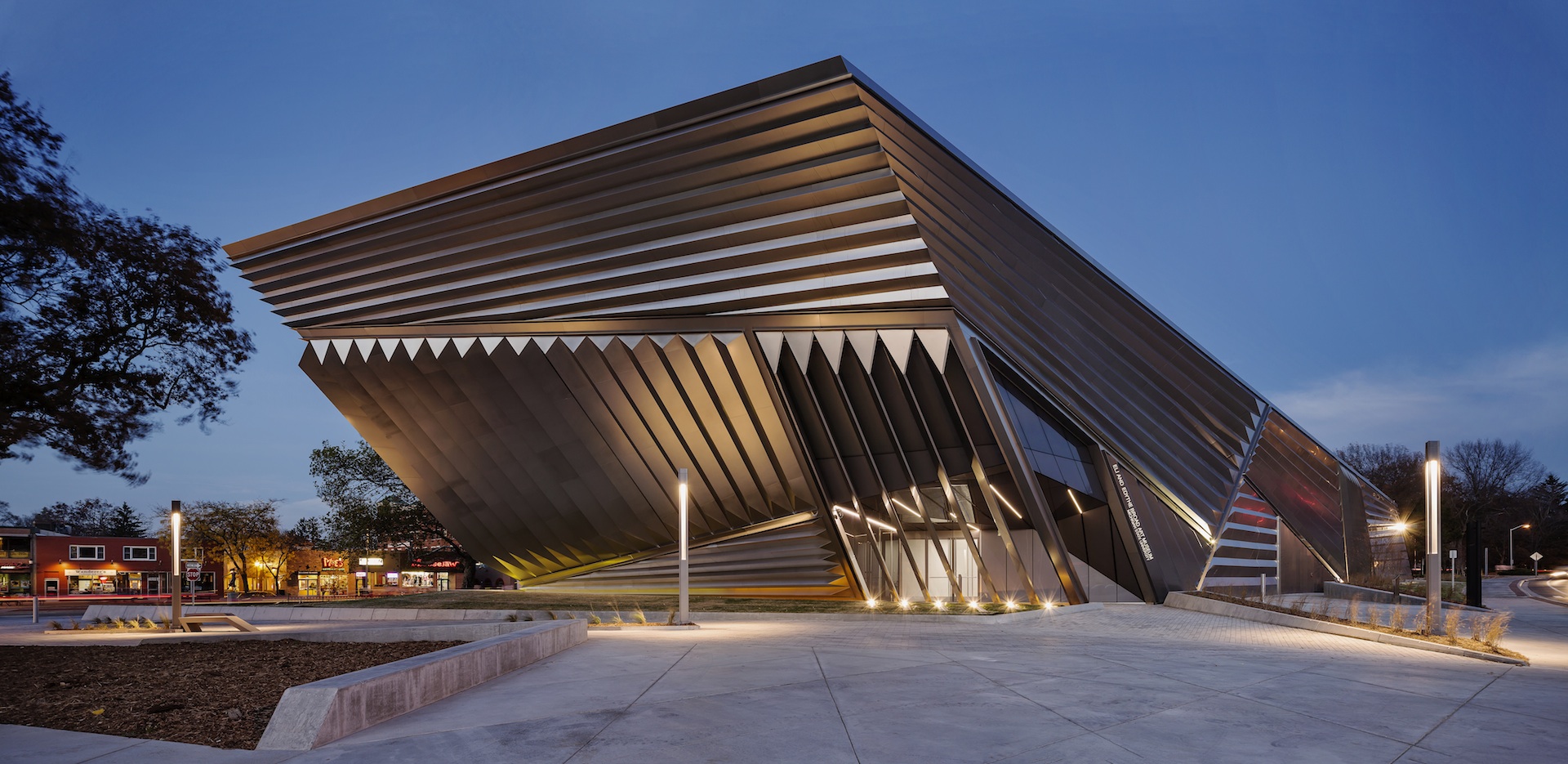 [Image by Paul Warchol (2012). Copyright the photographer. Courtesy of Zaha Hadid Architects.]
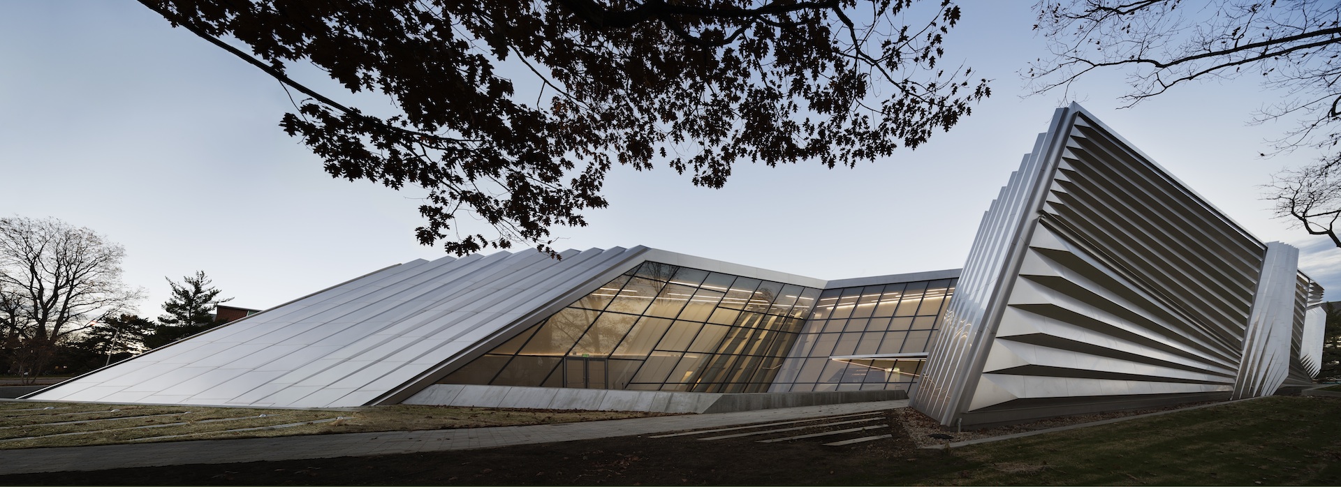 [Image by Paul Warchol (2012). Copyright the photographer. Courtesy of Zaha Hadid Architects.]
Views of the university are most dramatic from a large open hall on the ground floor that is enveloped by floor-to-ceiling windows. A corresponding area above, which connects three second-floor galleries, includes an interior wall of glass, providing an elevated vantage point. At the edge of this eastern wing of the museum, where its uniformity breaks in two, the outer wall of a courtyard is only a few feet high, exposing an indoor-outdoor area that transitions into the rest of the campus.
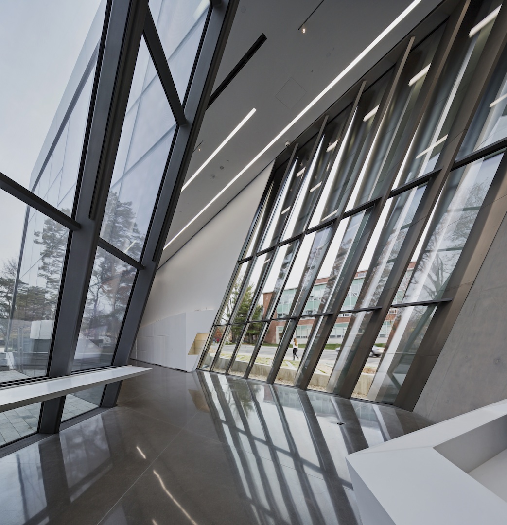 [Image by Paul Warchol (2012). Copyright the photographer. Courtesy of Zaha Hadid Architects.]
The exterior shell of the building is dressed in long steel plates that filter light into galleries at different directions. This metallic casing emphasizes geometric masses that are pieced together like a three-dimensional puzzle in some sort of gravitational feat. With its Futurist angles, the “radically abstract object” (as it is referred to by Zaha Hadid Architects partner Patrik Schumacher) has a sculptural appearance.
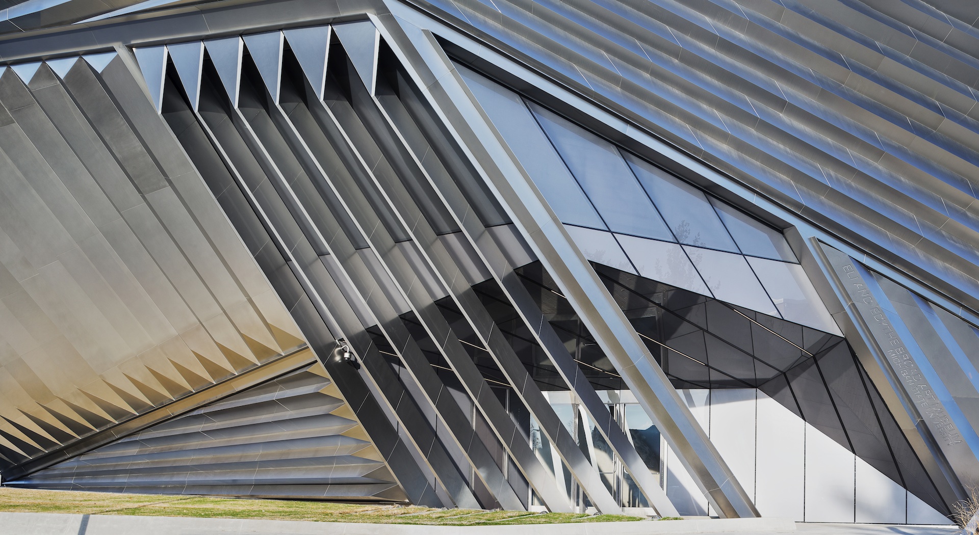 [Image by Paul Warchol. Copyright the photographer. Courtesy of Zaha Hadid Architects.]
“The story of the museum has changed a great deal—it is no longer just a collection of rooms that connect sequentially as in a palace,” writes Hadid. In the US, however, a conservative streak continues to dominate the institutional prototype. American museums have been slow to abandon traditional layouts, maintaining palatial environments and the postwar white cube galleries that were first scrutinized by artist and critic Brian O’Doherty in a series of 1976 essays for Art Forum. In such static arenas, O’Doherty warns, certain political and economic variables are inevitably in effect when art is seperated from the outside world in tomb-like settings. Although he identifies the implementation of the white cube with the rise of Modernism (specifically certain types of modernist painting and “transcendental” architecture), Frank Lloyd Wright’s Solomon R. Guggenheim Museum in New York (1959) was one of the first examples to go beyond such rigid framing (see Victoria Newhouse’s Towards a New Museum, Monacelli Press: 2007).
Comprised of a large inverted spiral with adjoining rooms and a smaller rotunda that branch out from minor platforms between sloping floors, Wright’s circular design allows viewers to take in numerous displays at once. With the momentum of ascending and descending bodies, its cavernous center releases the “spectator” from a one-to-one ratio of viewing or interaction and the confinements of an enclosed gallery. As the curved nature of this area presents a challenge to the exhibiting of two-dimensional works, curators have often been inspired to confront long-standing art world edicts in shows that cogently use its open format. Despite containing windowless walls and a highly aestheticized leitmotif (classic components of the white cube according to O’Doherty), the New York edifice revolutionized the museum archetype.
As Wright’s final project, the Guggenheim incorporates many of the principles that motivated his work; its inspection of spatial concepts and their potential impact on existing social orders is of primary importance. In the dozens of Prairie style homes that he built during the first decades of the twentieth century, this fading of boundaries was executed through lines that were carried from the natural environment of a specific site, such as the grasslands of the American Midwest, throughout exterior frames. This fusion was maintained in the opening up of domestic interiors by doing away with the boxed-in arrangement of Victorian parlors. In corporate structures, such as the Johnson Wax headquarters in Racine, Wisconsin (1936-39), the architect created large communal workrooms that include custom furniture and expansive celings that he likened to the sky. Although he had hoped that the Guggenheim Foundation would choose a location other than Manhattan (which he felt was overdeveloped), he continued to call for “organic architecture,” in which every element of a building is visually and physically connected to its surroundings.
In 1992, Hadid was invited to design the Guggenheim exhibition The Great Utopia: The Russian and Soviet Avant-Garde, 1915-1932. Well-versed in Suprematism and Constructivism—two seminal twentieth-century art movements that have greatly influenced her practice—she utilized Wright’s reversed ziggurat to highlight the avant-garde’s reorganizing of space through color, form, volume, and material. With a complex system of displays, she transformed the museum’s interior into an extension of the featured art. On the second floor of the main rotunda a series of bright red display screens cut through its winding ramp, emphasizing alternating depths of perception. In the Guggenheim’s side galleries, paintings were hung on freestanding glass panels that were situated throughout the room, giving the illusion of floating compositions; platforms were positioned on the floor or attached to walls at angles so that overlapping lines and shapes of artworks seemed to travel past picture planes and flat surfaces. If corners and flush walls are emblematic of the limitations of the gallery setting and its privileging of certain constructs, Hadid reminded viewers of the radical ways in which Kazimir Malevich and his contemporaries opposed hierarchical territories through individual works and their historic group shows. The painter’s breakthrough “Black Square” was placed in an upper corner of a room as it had been in The Last Futurist Exhibition of Paintings 0.10’ (1915), its perched orientation in reference to the Russian tradition of hanging religious icons in homes.
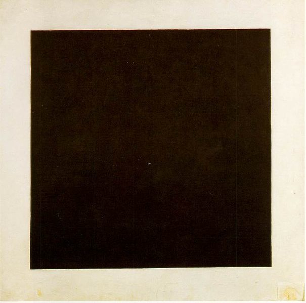 [Kazimir Malevich`s "Black Square" (1915). State Russian Museum, Saint Petersburg. Image via Wikimedia Commons.]
By identifying a series of limited shapes and colors through a “non-objective” art that is independent of “any aesthetic considerations of beauty, experience or mood,” Malevich advocated a move towards infinite space where new collective phenomena can arise. Complementing this consideration of the pictorial, are Vladimir Tatlin’s Constructivist reliefs, which break free of the picture plane by contrasting the tactile qualities of wood, metal, and glass as masses that seem to come together in levitated forms. Through the avant-garde, the dissolving of lines of Suprematism and the like-minded application of volume and movement of Constructivism were employed in stage design, architecture, graphic design, photography, and cinema.
The immediate (and most obvious) link between Wright and the Soviet modernists is the use of the spiral as the ultimate representation of uninterrupted space and time. The historical intersections are far greater, however, as both were part of a larger modernist current, the ideals of which were applied at length in the Bauhaus but never fully realized past early experiments.
Commenting on the 1979 Museum of Modern Art exhibition Transformations in Modern Architecture, Ada Louise Huxtable describes the “youthful revolutionaries” who had become “elder statesman” with the repositioning of early twentieth-century architecture as a “purified” form of “aesthetic exercises” (On Architecture: Collected Reflections on a Century of Change, Walker Publishing: 2008). While Huxtable was clearly wary of post-modern developments, which she referred to as “aesthetic dandyism,” she was also reluctant to concede that the modernist “dream” could have been brought to fruition. For the critic, despite modern architecture’s progressive stance, the severity of the postwar reality was too great for any built form to contend with.
Huxtable was correct: the modernist project was never completed, in part because artists and “tastemakers” alike eventually dismissed it across disciplines. Amidst her sharp observations, however, she hints at exactly what went wrong, the “tastemakers” were in fact propagating the standards of the establishment(s). As it sought to supplant aesthetics that were in the service of power, Modernism faced overwhelming opposition wherever it was set to dethrone the status quo. Although in the visual arts its two central branches, figuration and abstraction, were initially socially-engaged and determined by radical politics, they were quickly commandeered as part of a bitter standoff between global superpowers, particularly during the Cold War.
Theory and art criticism had a significant role in downplaying the impact and promise of the modernist undertaking. In architecture, Huxtable points to the diluted terms that came to define the International Style, specifically as it appeared in an eponymous publication by historian Henry-Russell Hitchcock and architect and curator Philip Johnson. In this “manual on style” that was released alongside Hitchcock and Johnson’s 1932 MoMA venture Modern Architecture, the austere aesthetics of the pinnacle movement were seperated from visionary underpinnings. Such theoretical reframing would prove to be devastating.
At a time when “aesthetic dandyism” was in its prime, Hadid was one of the few (globally visible) architects to insist that the modernist project deserved further exploration (see Detlef Mertin’s “The Modernity of Zaha Hadid,” Zaha Hadid, Guggenheim Museum Publications: 2006).
Four decades after Wright’s sole museum was completed, the American art world witnessed a second coming; in 2003, Hadid inaugurated the Lois and Richard Rosenthal Center for Contemporary Art in Cincinnati, her first US building.
Also known as the Contemporary Arts Center, the museum was founded in 1939 and was one of the first American institutions to exhibit contemporary art, albeit without a permanent collection. This move against acquiring works intentionally distinguishes the Rosenthal Center from the innumerable museums that assume the inflated roles of cultural custodians, alternatively allowing it to concentrate on a programming platform that engages a wide audience.
Located in the heart of Cincinnati’s arts district, the Rosenthal Center emerges from the urban fabric of its site. The sidewalk of its corner lot continues under a glass front that contains the museum’s entrance, traveling through the span of the ground floor to the edge of the building where it becomes a back wall. Fastening the edifice to the city’s tectonic makeup, Hadid refers to this prominent detail as an “urban carpet.” From street-level views, the structural seam directs the eye through a series of mammoth blocks that are stacked as fragments. On the side of the museum where these rectangular masses differ in length and seem to drift into the skyline, a single unit takes on the appearance of Malevich’s "Black Square," hovering above a Cincinnati intersection as additional shapes dance around it.
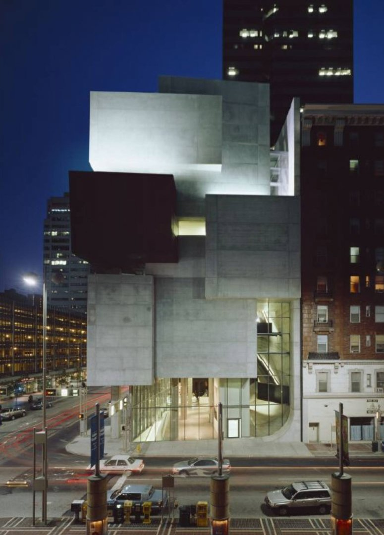 [Image by Roland Halbe (2003). Copyright the photographer. Courtesy of the Lois and Richard Rosenthal Center for Contemporary Art.]
The building is a Suprematist composition applied to a lived reality, demonstrating the modernist understanding of infinity more effectively than Malevich’s canvases or his architectural mockup "Alpha" (1920), a plaster sculpture that visualizes the physical relationships of his orthogonal “non-objects.” In the Rosenthal Center, this concept is grounded then expanded from its theoretical beginnings only to be propelled upward and outward, back into space.
Malevich’s fascination with aerial photography forged his original interest in the organization of the world according to a sequence of basic shapes and colors that he recognized in all things. The system that would result from such organization would be one of collective production, of a unity that would cast off the “chaotic forms” that blocked “creativity’s path.” Although his experiments mostly manifested in visual culture, he was not exclusively concerned with the realm of art that had fallen prey to the whims of the academy or patrons. On the contrary, he was chiefly interested in how this path could lead to the greater development of life, which he argued is “based on the economics of subsistence and of movement in general, whence stem politics, rights and liberty” (K.S. Malevich: Essays on Art 1915-1933, Vol. I, Rapp and Whiting: 1968).
First published in 1920, Malevich’s essay “The Question of Imitative Art” proclaims, “At the essence of the new arts lies not representation but creative construction: raising ourselves by means of constructions we achieve the highest natural development in all humanity.” As many Suprematist artists had aligned themselves with the 1917 revolution, Malevich also contends that while new levels of achievement can be reached through “the creative building of life’s forms,” only political struggle can succeed in overhauling “the old world.”
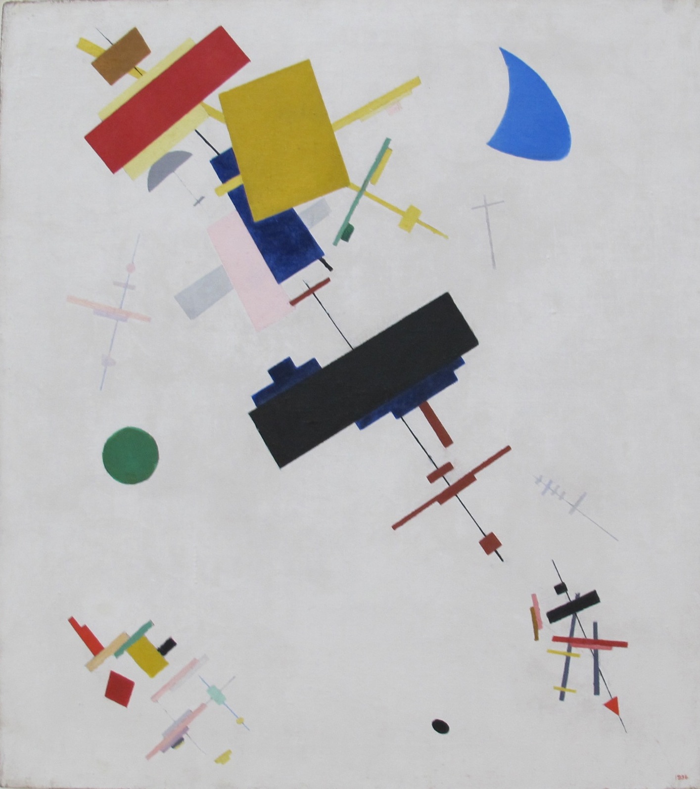 [Kazimir Malevich "Supremus no. 56" (1916). Image via wikimedia commons.]
Hadid builds with the advantage of a technology that has finally caught up with her otherworldly designs. She also has the benefit of historical perspective and was able to pinpoint early on where the Russian social experiment (and Modernism in general) was unable to follow through with “creative building.” Hadid “quickly disposed of these seemingly inviolate architectural principles and translated the warped and anti-gravitational space of Russian avant-garde painting and sculpture into her own unique architectural language,” writes Patrik Schumacher (“The Russian Avant Garde—A Glimpse Back into the Future,” Zaha Hadid and Suprematism, Hatje Cantz: 2012). She not only brought the concept of infinity down to earth—she pried open Suprematist compositions to allow the internal flow of energy and movement. The Rosenthal Center’s irregularly shaped galleries of various widths and heights encourage a broad spectrum of art and multi-perspective viewing; the museum experience is never a monotonous endeavor. Within the interior of the structure, which appears to be in constant motion and in continual exchange with the outside, she stretched the limits of interactions that might arise between visitors, featured art, and the city.
More recently, Hadid’s firm has set its sights on other unresolved territories, exploring nature’s forms through several projects. While the outlines of organic shapes are visible in such designs, their endpoints clearly tie into the architect’s evolving, non-static bodies. The Eli and Edythe Broad Art Museum arrives closest to Wright’s notion of “indigenous” architecture that is possible in a place like Michigan where the landscape has been changed by merciless “development,” industrialization, “redevelopment” and consequent socioeconomic crises. Rather than ignoring these factors by sealing off the museum from its environment, Hadid provides adjacent communities with a way to move forward.
![[Zaha Hadid`s Eli and Edythe Broad Art Museum. Image by Paul Warchol (2012). Copyright the photographer. Courtesy of Zaha Hadid Architects]](https://kms.jadaliyya.com/Images/357x383xo/PaulWarcholBroad1.jpg)


